BRIEF Language learning apps and tools are so accessible nowadays that it's easy to find many people currently "learning a language." These tools, however, lack a vital component of learning — immersion.

GOAL I wanted to design a product that privides a way for people to learn a foreign language through practical lessons and conversation practice with live video chat.

DISCOVERY In August 2023, I started the discovery phase with a comparative analysis of language apps and user interviews with people who have experience learning a foreign language. I wanted to address their goals, motivations, and pain points when it comes to learning languages.

SWOT Analysis for Duolingo

STRENGTHS

  • Established, strong user base

  • Large selection of languages

  • Gamification approach

OPPORTUNITIES

  • New marketing strategies to push awareness of new initiatives

  • More products to pay for vs revenue from ads

WEAKNESSES

  • Sentences aren't true to real life

  • Only one right answer for translating

  • Feedback can be perceived as robotic

  • Alternative language applications catering to various educational objectivesIntense language courses

From the interviews, I learned:

Users want control and visibility over their curriculum.

  • People want to learn not only the language, but also the culture to contextualize material.

  • Users dislike repetition in exercises.

  • Many people seek video-based exercises.

  • After refining this information, I sketched out the main flows, and iterated on the designs with rapid prototyping. I wanted the onboarding to be an opportunity to showcase that Rally is different from other language learning apps with its video-based learning material and video chat.

Affinity Map from Users Interviews

User Personas

With the data gathered from comparative analysis and user interviews, I created personas that represent two types of users from the target demographic.

User Flows

To further understand my persona Calvin, I created user flows. These flows also served as my starting points to map out the information architecture of my app.​

Calvin’s Objective As an adult learner, Calvin wants extra support when it comes to learning a foreign language so he can showcase his skills at work.

Ilya’s Objective As a social young adult, Ilya wants to share her vocab list with her friends so they can also learn and be ready for their trip.

With the IA established, I sketched out the main flows, and iterated on the designs with rapid prototyping. I wanted the onboarding to be an opportunity to showcase that Rally is different from other language learning apps with its video-based learning material and video chat.

Low and Mid Fidelity Prototypes

Once I had my mid-fidelity prototype ready, it was time to test out my design! I held six moderated in-person and remote usability tests.My test objectives were:

  • Observe points of friction and areas of delight

  • Decide which options to make available in the tab menu based on user expectations

​After categorizing the data, I used a rainbow spreadsheet to make better sense of what my priorities should be in the next iteration.

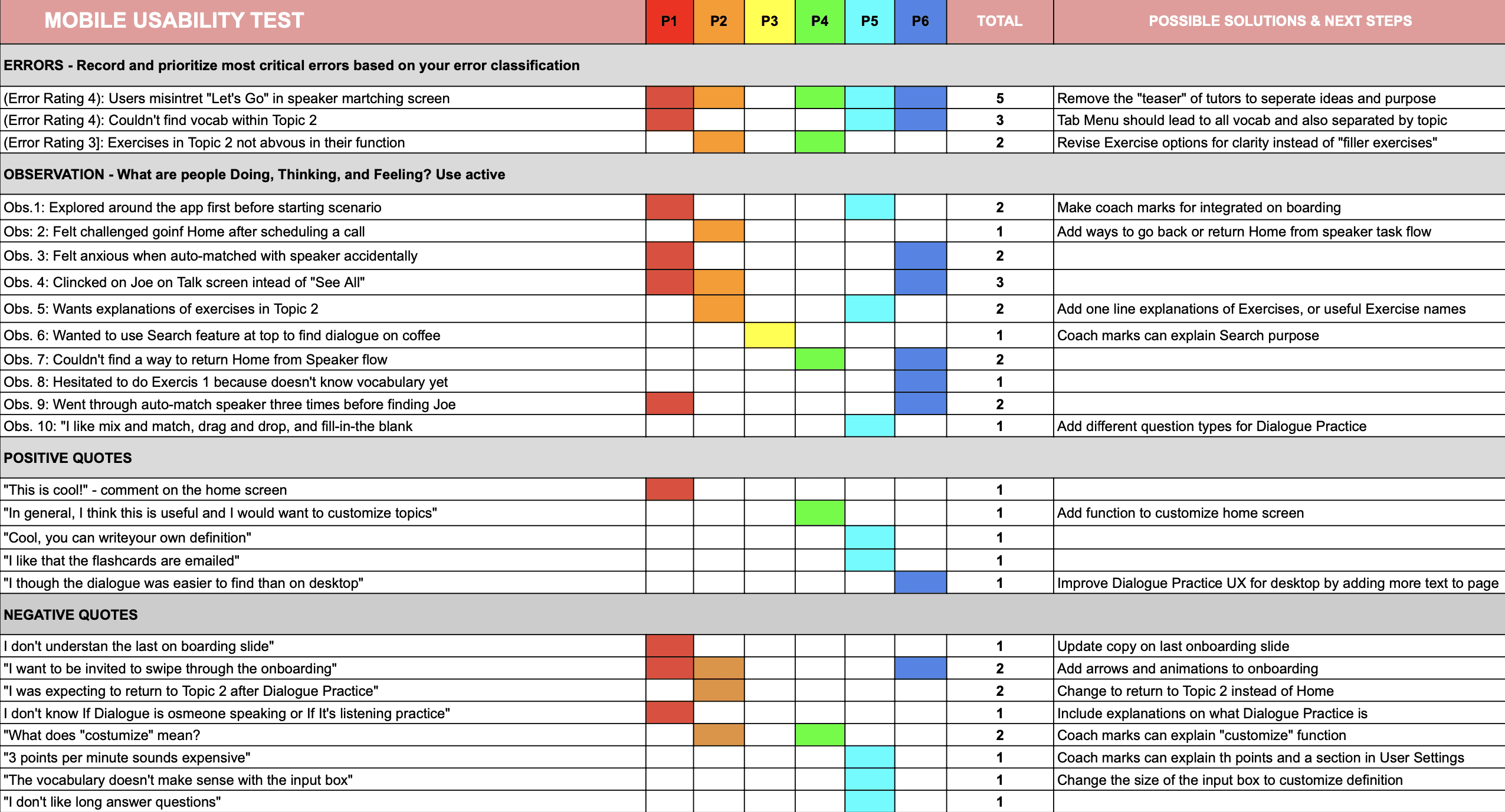
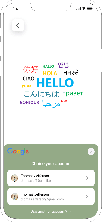
P1 Mobile navigated through the app initially

P1 Mobile device experienced tension when inadvertently paired with a speaker

Observasion

Challenges with P2mobile when returning home post call-booking

P2mobile tapped. on Joe's Discussion page instead of "View All"

P2 seeks clarification for tasks in Topic 2

Dialogue Practice in P3 desktop failed to scroll for questions

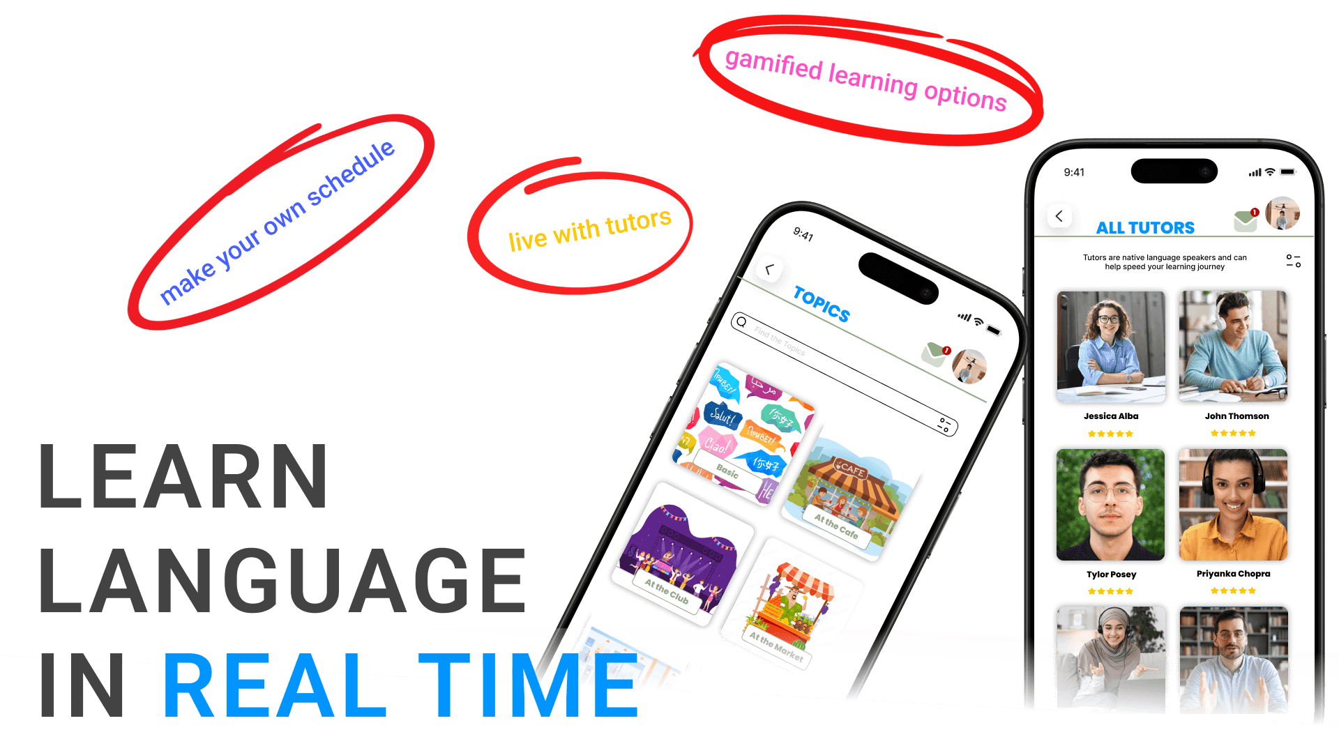
P4 Desktop discovered dialogue exercise "At the cafe easily"

P4 Mobile aimed to employ the Search function to locate dialogue

P4 Mobile went to Talk directly to find tutors

P4 Mobile no way to go back from Speaker flow

P4 Mobile felt hesitant doing Exercise 1 because doesn't know vocabulary yet

P5 Mobile "3pts/min sounds expensive"

Joe 3x auto-matched with P6 mobile, as processed.

P5 Mobile liked flashcards are emailed

P6 Mobile though dialogue was easier than desktop

P5 Mobile "Cool! You can write your own definition"

P5 Mobile likes mix & match, drag & drop, fill-in-the-blank

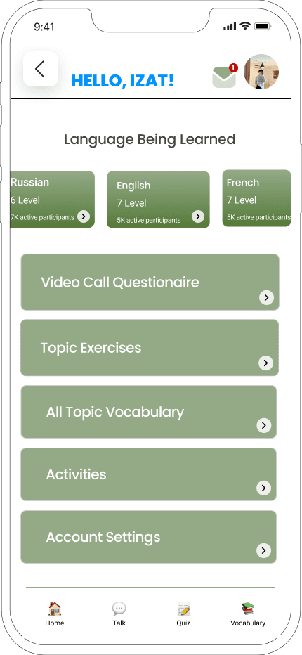
P4 Thinks It's pretty useful and wants to customize topics

P3 Desktop "Looks approachable and mobile friendly"

P1 Mobile
"This is cool!"
-Home Screen

Positive Quotes

P3 Desktop menu switches L to R during vocabulary task

P5 Desktop doesn't like long answers

P4 Mobile vocabulary doesn't make sense with input box

P4 Desktop expressed confusion re: Menu

P3 Desktop expressed confusion re: Menu

P2 Desktop on Topic 2, looks like vocabulary and exercises combined

P2 Mobile "What does customize mean"

P2 Mobile expected to return to Topic 2 after Dialogue Practice

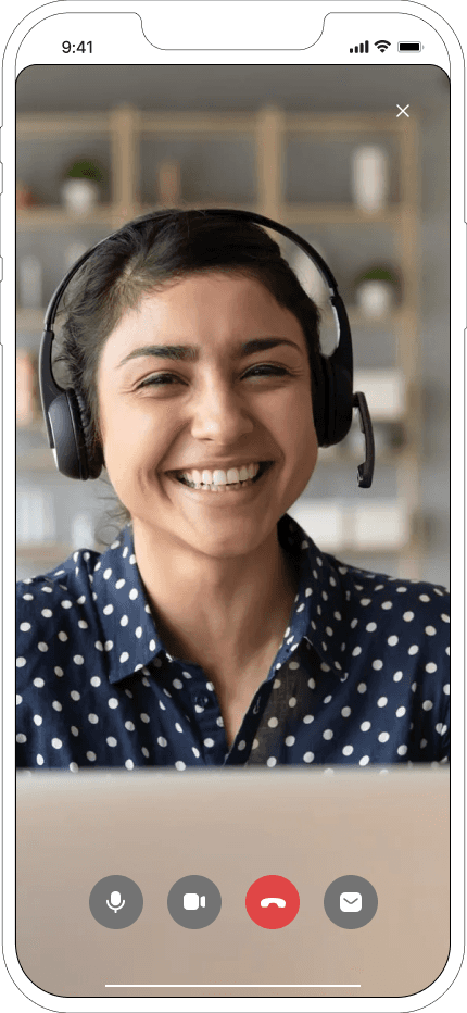
P1 Mobile don't know Dialogue is video or listening practice

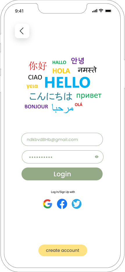
P1 Mobile want to be invited to swipe thru onboarding

P1 Mobile does't understand last onboarding slide

Negative Quotes

P4 Desktop clicked on Coffee Culture for vocabulary

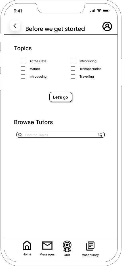
P2 Mobile misinterpret "Lets's Go"

P2 Mobile went to tab menu for vocabulary

P1 Mobile Exercises in Topic 2 not obvious in function

P1 Mobile could not find vocabulary within topic

Errors

Note:
Sticky notes with a " " mean another participant expressed a similar thought or issue.

From this data, I discovered that, as a designer, I tend to inundate one screen with too much function, which overwhelms and confuses the user. For example, the second screen in my Balsamiq wireframes ought to separated into two screens.

USABILITY TESTING

Once I addressed the top issues to solve based on Nielsen’s severity ratings, it was time to breathe life into the app with color and UI elements.​

UI Design

Once I addressed the top issues to solve based on Nielsen’s severity ratings, it was time to breathe life into the app with color and UI elements.​

UI Design

Learn more projects

Bubbles

AI Meeting Note Taker & Screen Recorder

GenDraft

AI Gmail Add-On

Language Learning App

AI Gmail Add-On